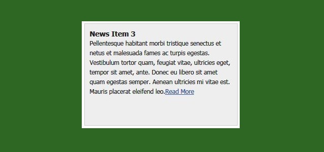
One of the sweet effects made easy by JavaScript frameworks like MooTools and jQuery is animation. Here's a quick MooTools code snippet that shows how you can add animating a background image to any element on a page.
The first step is assigning the image as a background image for our given container. Be sure to repeat the background horizontally!
The HTML
<script src="http://ajax.googleapis.com/ajax/libs/mootools/1.3.1/mootools.js" type="text/javascript">
</script>
<script type="text/javascript">
  window.addEvent('domready',function() {
   //settings
   var duration = 40000;
   var length = 2000;
   var count = 0;

   var tweener;

   // Executes the standard tween on the background position
   var run = function() {
    tweener.tween('background-position','-' + (++count * length) + 'px 0px');
   };

   // Defines the tween
   tweener = $('animate-area').setStyle("background-position","0px 0px").set('tween',{
    duration: duration,
    transition: Fx.Transitions.linear,
    onComplete: run,
    wait: false
   });

   // Starts the initial run of the transition
   run();

  });
</script>
The first step, as always is getting our settings ready for the show. The next piece is putting the animation function in place. We increment the negative background left position counter calculation to keep the show rolling. Last step is playing the show!
Make sure the animation speed is very slow and subtle -- a rapid background speed could make your users pass out. On the other hand, implementing it tastefully will make your website unique.
The idea behind the script was to create a floating navigation that follows the moving cursor throughout the page. The goal was to make the menu itself as minimal as possible with “discreet” float animation to avoid obtrusiveness and help usability. The end result features simple markup, two levels navigation and styling via css. An extra feature included in the plugin is the function that animates the page to anchor points. See demo in this site.
How to use it
Inside the head tag of your document attach the menu stylesheet (malihu.cfm.css) which holds the style for the menu and load both jquery.min.js (straight from Google) and the jquery.easing.1.3.js plugin that adds custom easing to our animations.
You can have a single sub-level on menu options by adding an additional unordered list inside list items.
Add the menu script and plugin at the end of the document, just before the closing body tag.
<script>
//cursor following menu config
$mouseover_title="+ MENU"; //menu title text on mouse-over
$mouseout_title="MENU"; //menu title text on mouse-out
$menu_following_speed=2000; //the speed in which the menu follows the cursor (in milliseconds)
$menu_following_easing="easeOutCirc";
$menu_cursor_space=30; //space between cursor and menu
$menu_show_speed="slow"; //menu open animation speed
$menu_show_easing="easeOutExpo"; //menu open animation easing type
$menu_hide_speed="slow"; //menu close animation speed
$menu_hide_easing="easeInExpo"; //menu close animation easing type
</script>

<script src="malihu.jquery.cfm.js"></script>
You can easily configure the menu by changing each variable to your liking.
In the following tutorial we will create an asymmetrical image slider with a little twist: when sliding the pictures we will slightly rotate them and delay the sliding of each element. The unusual shape of the slider is created by some elements placement and the use of thick borders. We will also add an autoplay option and the mousewheel functionality.
First, we will wrap all our slider elements in a wrapper with the class “rm_wrapper”:
<div class="rm_wrapper">
...
</div>
Inside of that wrapper we will have a container for the actual slider list, some mask and corner elements, the heading and a hidden div that will contain all the image sets:
So the unordered lists will have the first set of four images where each list element has some data attributes for the image sets and the rotation degree. We will use that data to know which images come next and how much each image should be rotated.
The mask and corner divs will be absolute elements that we will place on top of the slider, slightly rotated in order to cover some areas. Since we will use the same background color for these elements like the body’s background color, we will create the illusion of the images being shaped in a certain way.
Then we’ll add the elements for the navigation and the autoplay controls:
First, we’ll reset some styles and define the properties for the body. (Remember, if we would have another background color, we would want to change the background and border colors of some of the elements in our slider, too.)
Let’s define the width for the ul to be bigger than the container since we want to make the list element float next to each other:
.rm_container ul{
 width:1170px;
}
By giving a negative left margin and a thick border to the list element, we will overlap the images and cut off the right sides so that we create our asymmetrical shapes by rotating the elements then. The border color will be the same like the background color of the body (or the container).
.rm_container ul li img{
 position:absolute;
 top:0px;
 left:0px;
}
In the following we will style the mask and the corner elements. They will be all positioned absolutely and we’ll give them the grey background color. By rotating them, we’ll make the images to appear as being “shaped”:
The main idea for the slider functionality is to add another image before the current one with a slightly increased rotation degree than the current item. Then we will animate the rotation and make the new images appear.
So let’s start by caching some elements and checking if we are dealing with a special needs browser in order to deal with some issues:
//our 4 items
var $listItems   = $('#rm_container > ul > li'),
 totalItems  = $listItems.length,

 //the controls
 $rm_next  = $('#rm_next'),
 $rm_prev  = $('#rm_prev'),
 $rm_play  = $('#rm_play'),
 $rm_pause  = $('#rm_pause'),

 //the masks and corners of the slider
 $rm_mask_left = $('#rm_mask_left'),
 $rm_mask_right = $('#rm_mask_right'),
 $rm_corner_left = $('#rm_corner_left'),
 $rm_corner_right= $('#rm_corner_right'),

 //check if the browser is <= IE8
 ieLte8   = ($.browser.msie && parseInt($.browser.version) <= 8),
//difference of animation time between the items
var timeDiff   = 300,
 //time between each image animation (slideshow)
 slideshowTime  = 3000,
 slideshowInterval,
 //checks if the images are rotating
 isRotating   = false,
 //how many images completed each slideshow iteration
 completed   = 0,
 /*
 all our images have 310 of width and 465 of height.
 this could / should be dynamically calculated
 if we would have different image sizes.

 we will set the rotation origin at
 x = width/2 and y = height*2
 */
 origin    = ['155px', '930px'],
 init    = function() {
  configure();
  initEventsHandler();
 },
 //initialize some events
 initEventsHandler = function() {
  /*
  next and previous arrows:
  we will stop the slideshow if active,
  and rotate each items images.
  1  rotate right
  -1  rotate left
  */
  $rm_next.bind('click', function(e) {
   stopSlideshow();
   rotateImages(1);
   return false;
  });
  $rm_prev.bind('click', function(e) {
   stopSlideshow();
   rotateImages(-1);
   return false;
  });
  /*
  start and stop the slideshow
  */
  $rm_play.bind('click', function(e) {
   startSlideshow();
   return false;
  });
  $rm_pause.bind('click', function(e) {
   stopSlideshow();
   return false;
  });
  /*
  adds events to the mouse and left / right keys
  */
  $(document).bind('mousewheel', function(e, delta) {
   if(delta > 0) {
    stopSlideshow();
    rotateImages(0);
   }
   else {
    stopSlideshow();
    rotateImages(1);
   }
   return false;
  }).keydown(function(e){
   switch(e.which){
    case 37:
     stopSlideshow();
     rotateImages(0);
     break;
    case 39:
     stopSlideshow();
     rotateImages(1);
     break;
   }
  });
 },
 /*
 rotates each items images.
 we set a delay between each item animation
 */
 rotateImages  = function(dir) {
  //if the animation is in progress return
  if(isRotating) return false;

  isRotating = true;

  $listItems.each(function(i) {
   var $item     = $(this),
    /*
    the delay calculation.
    if rotation is to the right,
    then the first item to rotate is the first one,
    otherwise the last one
    */
    interval   = (dir === 1) ? i * timeDiff : (totalItems - 1 - i) * timeDiff;

   setTimeout(function() {
     //the images associated to this item
    var $otherImages  = $('#' + $item.data('images')).children('img'),
     totalOtherImages = $otherImages.length;

     //the current one
     $img    = $item.children('img:last'),
     //keep track of each items current image
     current    = $item.data('current');
     //out of bounds
     if(current > totalOtherImages - 1)
      current = 0;
     else if(current < 0)
      current = totalOtherImages - 1;

     //the next image to show and its
     //initial rotation (depends on dir)
     var otherRotation = (dir === 1) ? '-30deg' : '30deg',
      $other   = $otherImages.eq(current).clone();

     //for IE <= 8 we will not rotate,
     //but fade out / fade in ...
     //better than nothing :)
     if(!ieLte8)
      $other.css({
       rotate : otherRotation,
       origin : origin
      });

     (dir === 1) ? ++current : --current;

     //prepend the next image to the
$item.data('current', current).prepend($other); //the final rotation for the current image var rotateTo = (dir === 1) ? '80deg' : '-80deg'; if(!ieLte8) { $img.animate({ rotate : rotateTo }, 1200, function(){ $(this).remove(); ++completed; if(completed === 4) { completed = 0; isRotating = false; } }); $other.animate({ rotate : '0deg' }, 600); } else { $img.fadeOut(1200, function(){ $(this).remove(); ++completed; if(completed === 4) { completed = 0; isRotating = false; } }); } }, interval ); }); }, //set initial rotations configure = function() { if($.browser.msie && !ieLte8) rotateMaskCorners(); else if(ieLte8) hideMaskCorners(); $listItems.each(function(i) { //the initial current is 1 //since we already showing the first image var $item = $(this).data('current', 1); if(!ieLte8) $item.transform({rotate: $item.data('rotation') + 'deg'}) .find('img') .transform({origin: origin}); }); }, //rotates the masks and corners rotateMaskCorners = function() { $rm_mask_left.transform({rotate: '-3deg'}); $rm_mask_right.transform({rotate: '3deg'}); $rm_corner_left.transform({rotate: '45deg'}); $rm_corner_right.transform({rotate: '-45deg'}); }, //hides the masks and corners hideMaskCorners = function() { $rm_mask_left.hide(); $rm_mask_right.hide(); $rm_corner_left.hide(); $rm_corner_right.hide(); }, startSlideshow = function() { clearInterval(slideshowInterval); rotateImages(1); slideshowInterval = setInterval(function() { rotateImages(1); }, slideshowTime); //show the pause button and hide the play button $rm_play.hide(); $rm_pause.show(); }, stopSlideshow = function() { clearInterval(slideshowInterval); //show the play button and hide the pause button $rm_pause.hide(); $rm_play.show(); }; return {init : init};
As you noticed, we will treat older browsers a bit differently so that the slider works properly.
The absolute positioning is essential to proper animation. This example no longer requires a fixed height for each news item. Add a minimum height so only one item shows up within the scroller window at a time.
The Dojo JavaScript
<script src="http://ajax.googleapis.com/ajax/libs/dojo/1.6/dojo/dojo.xd.js" type="text/javascript"></script>
<script type="text/javascript">
dojo.require('dojo.NodeList-fx');
dojo.addOnLoad(function() {
  /* settings */
  var list = dojo.query('#news-feed ul'),
    items = list.query("li"),
    showDuration = 3000,
    scrollDuration = 500,
    scrollTopDuration = 200,
    index = 0,
    interval;

  /* movement */
  var start = function() { interval = setInterval(move,showDuration); };
  var stop = function() { if(interval) clearInterval(interval); };
  var reset = function() {
      list.anim({ top: 0}, scrollTopDuration, null, start);
  };
  /* action! */
  var move = function() {
      list.anim({ top: (0 - (dojo.coords(items[++index]).t)) }, scrollDuration, null, function(){
      if(index == items.length - 1) {
        index = 0-1;
        stop();
        setTimeout(reset,showDuration);
      }
      });
  };

  /* stop and start during mouseenter, mouseleave  */
  list.onmouseenter(stop).onmouseleave(start);

  /* go! */
  start();
});
</script>
This functionality will come in the form of an easy to use jQuery plugin that you can easily incorporate into any website which displays a set of featured photos with a camera shutter effect.
<script src="http://ajax.googleapis.com/ajax/libs/jquery/1.5.2/jquery.min.js"></script>
<script src=".../jquery.shutter.js"></script>
<script type="text/javascript">
$(document).ready(function(){
var container = $('#container'),
li = container.find('li');
// Using the tzShutter plugin. We are giving the path
// to he shutter.png image in the plugin folder and two
// callback functions.
container.tzShutter({
imgSrc: 'assets/jquery.shutter/shutter.png',
closeCallback: function(){
// Cycling the visibility of the li items to
// create a simple slideshow.
li.filter(':visible:first').hide();
if(li.filter(':visible').length == 0){
li.show();
}
// Scheduling a shutter open in 0.1 seconds:
setTimeout(function(){container.trigger('shutterOpen')},100);
},
loadCompleteCallback:function(){
setInterval(function(){
container.trigger('shutterClose');
},4000);
container.trigger('shutterClose');
}
});
});
</script>
<head>
<style>
#container{
width:640px;
height:400px;
margin:0 auto;
border:5px solid #fff;
overflow:hidden;
-moz-box-shadow: 0 0 10px rgba(0, 0, 0, 0.3);
-webkit-box-shadow: 0 0 10px rgba(0, 0, 0, 0.3);
box-shadow: 0 0 10px rgba(0, 0, 0, 0.3);
}

#container ul{
list-style:none;
padding:0;
margin:0;
}
#page{
width:650px;
height:400px;
}
#container img{
padding:0;
}
.shutterAnimationHolder .film canvas{
display: block;
margin: 0 auto;
}

.shutterAnimationHolder .film{
position:absolute;
left:50%;
top:0;
}

.shutterAnimationHolder{
position:absolute;
overflow:hidden;
top:0;
left:0;
z-index:1000;
}
</style>
</head>
<body>
<div id="page">

<h1>Shutter Folio Photography</h1>

<div id="container">
<ul>
<li><img src=".../img/1.jpg" width="640" height="400" /></li>
<li><img src=".../img/2.jpg" width="640" height="400" /></li>
<li><img src=".../img/3.jpg" width="640" height="400" /></li>
<li><img src=".../img/4.jpg" width="640" height="400" /></li>
</ul>
</div>

</div>
<script type='text/javascript'>
//<![CDATA[
(function(){
// Creating a regular jQuery plugin:
$.fn.tzShutter = function(options){
// Checking for canvas support. Works in all modern browsers:
var supportsCanvas = 'getContext' in document.createElement('canvas');
// Providing default values:
options = $.extend({
openCallback:function(){},
closeCallback:function(){},
loadCompleteCallback:function(){},
hideWhenOpened:true,
imgSrc: 'http://dl.dropbox.com/u/13256471/jquery.shutter/assets/jquery.shutter/shutter.png'
},options);
var element = this;
if(!supportsCanvas){
// If there is no support for canvas, bind the
// callack functions straight away and exit:
element.bind('shutterOpen',options.openCallback)
.bind('shutterClose',options.closeCallback);
options.loadCompleteCallback();
return element;
}
window.setTimeout(function(){
var frames = {num:15, height:1000, width:1000},
slices = {num:8, width: 416, height:500, startDeg:30},
animation = {
width : element.width(),
height : element.height(),
offsetTop: (frames.height-element.height())/2
},
// This will calculate the rotate difference between the
// slices of the shutter. (2*Math.PI equals 360 degrees in radians):
rotateStep = 2*Math.PI/slices.num,
rotateDeg = 30;
// Calculating the offset
slices.angleStep = ((90 - slices.startDeg)/frames.num)*Math.PI/180;
// The shutter slice image:
var img = new Image();
// Defining the callback before setting the source of the image:
img.onload = function(){
window.console && console.time && console.time("Generating Frames");
// The film div holds 15 canvas elements (or frames).
var film = $('<div>',{
className: 'film',
css:{
height: frames.num*frames.height,
width: frames.width,
marginLeft: -frames.width/2, // Centering horizontally
top: -animation.offsetTop
}
});
// The animation holder hides the film with overflow:hidden,
// exposing only one frame at a time.
var animationHolder = $('<div>',{
className: 'shutterAnimationHolder',
css:{
width:animation.width,
height:animation.height
}
});
for(var z=0;z<frames.num;z++){
// Creating 15 canvas elements.
var canvas = document.createElement('canvas'),
c = canvas.getContext("2d");
canvas.width=frames.width;
canvas.height=frames.height;
c.translate(frames.width/2,frames.height/2);
for(var i=0;i<slices.num;i++){
// For each canvas, generate the different
// states of the shutter by drawing the shutter
// slices with a different rotation difference.
// Rotating the canvas with the step, so we can
// paint the different slices of the shutter.
c.rotate(-rotateStep);
// Saving the current rotation settings, so we can easily revert
// back to them after applying an additional rotation to the slice.
c.save();
// Moving the origin point (around which we are rotating
// the canvas) to the bottom-center of the shutter slice.
c.translate(0,frames.height/2);
// This rotation determines how widely the shutter is opened.
c.rotate((frames.num-1-z)*slices.angleStep);
// An additional offset, applied to the last five frames,
// so we get a smoother animation:
var offset = 0;
if((frames.num-1-z) <5){
offset = (frames.num-1-z)*5;
}
// Drawing the shutter image
c.drawImage(img,-slices.width/2,-(frames.height/2 + offset));
// Reverting back to the saved settings above.
c.restore();
}
// Adding the canvas (or frame) to the film div.
film.append(canvas);
}
// Appending the film to the animation holder.
animationHolder.append(film);
if(options.hideWhenOpened){
animationHolder.hide();
}
element.css('position','relative').append(animationHolder);
var animating = false;
// Binding custom open and close events, which trigger
// the shutter animations.
element.bind('shutterClose',function(){
if(animating) return false;
animating = true;
var count = 0;
var close = function(){
(function animate(){
if(count>=frames.num){
animating=false;
// Calling the user provided callback.
options.closeCallback.call(element);
return false;
}
film.css('top',-frames.height*count - animation.offsetTop);
count++;
setTimeout(animate,20);
})();
}
if(options.hideWhenOpened){
animationHolder.fadeIn(60,close);
}
else close();
});
element.bind('shutterOpen',function(){
if(animating) return false;
animating = true;
var count = frames.num-1;
(function animate(){
if(count<0){
var hide = function(){
animating=false;
// Calling the user supplied callback:
options.openCallback.call(element);
};
if(options.hideWhenOpened){
animationHolder.fadeOut(60,hide);
}
else{
hide();
}
return false;
}
film.css('top',-frames.height*count - animation.offsetTop);
count--;
setTimeout(animate,20);
})();
});
// Writing the timing information if the
// firebug/web development console is opened:
window.console && console.timeEnd && console.timeEnd("Generating Frames");
options.loadCompleteCallback();
};
img.src = options.imgSrc;
},0);
return element;
};
})(jQuery);
//]]>
</script>
</body>
Circulate, a jQuery plugin make your images circulate around your page. This plugin requires the jQuery library as well as the easing plugin, just include a small piece of code to get the images circulate.
All of the imagery required comes via the CSS file -- no need to add your own styles.
The HTML and JavaScript
The first step in using any Dojo resources is adding a SCRIPT tag with a path to Dojo within the page and requiring the desired Dojo Toolkit resources:
<script>
// Parse the page upon load
djConfig = { parseOnLoad: true };
// When the DOM is ready and resources are loaded...
dojo.ready(function() {
// Create an instance
var lightbox = new dojox.image.Lightbox({ title:"My Sons", group:"My Sons", href:"https://blogger.googleusercontent.com/img/b/R29vZ2xl/AVvXsEgDGbc_saUj2fvV1InSNkYoxqdNWMIajvVWqoENRZeGA_NKCT6s3u2yQ7A8v9P_u3DcyVO3Jx-zumfhPKR-J0UOWtuGtKSa4CK7cRkkW0Bi-ID9UWCMuYGIUkkKrbFaEDCL9LTBGXKt94SP/s1600/My+Sons+1_490x395.jpg" });
// Start it up!
lightbox.startup();
})
</script>
<!--bring in the lightbox CSS
<link href='http://ajax.googleapis.com/ajax/libs/dojo/1.6/dojox/image/resources/Lightbox.css' rel='stylesheet' type='text/css'/>-->
<!--bring in the claro theme
<link href='http://ajax.googleapis.com/ajax/libs/dojo/1.6/dijit/themes/claro/claro.css' rel='stylesheet' type='text/css'/>-->
<script src="http://ajax.googleapis.com/ajax/libs/dojo/1.6/dojo/dojo.xd.js" type="text/javascript"></script>
<script type="text/javascript">
// Request dependencies
dojo.require("dojox.image.Lightbox");
</script>
With parseOnLoad in place, you can add links to the page with the data-dojo-type attribute set to dojox.image.Lightbox and instance-specific options within the data-dojo-props attribute. Here's a sample:
Groups allow you to have images available within...groups... with next and previous buttons. The title property provides a ...title... and the href property provides the content which should load within the lightbox. You may have any number of groups on the page. That's all that's needed to create a simple Dojo Lightbox declaratively!
With your instance created, start adding more images:
// Add another image by using the lightbox's _attachedDialog method...
lightbox._attachedDialog.addImage({
title:"My Sons 2",
group:"My Sons",  // Can be same group or different!
href:"MySons.jpg"
});
Regardless of declarative or programmatic implementation, you can show or hide the lightbox with the respective methods:
// Show the lightbox
lightbox.show();
// Hide the lightbox!
lightbox.hide();
As you'd expect with any Dojo Toolkit resource, dojox.image.Lightbox provides the usual onShow, onHide, and other utility methods that are helpful in customizing the Lightbox usage.
dojox.image.Lightbox and dojox.image.LightboxDialog are great resources available within Dojo's "treasure chest", DojoX. Other classes within the dojox.image namespace include Gallery, Slideshow, and Magnifier.
Ryan's CSS animation library, available with vanilla JavaScript, MooTools, or jQuery, and can only be described as a fucking work of art. His animation library is mobile-enabled, works a variety of A-grade browsers, and is very compact.
The HTML
The exploding element can be of any type, but for the purposes of this example, we'll use an A element with a background image:
Remember to set the text-indent setting so that the link text will not display. The explosion shards will be JavaScript-generated SPAN elements which are displayed as in block format. Note that the SPAN has the same background image as the A element -- we'll simply modify the background position of the element to act as the piece of the logo that each SPAN represents.
The jQuery JavaScript
Ryan also wrote the CSS animation code in jQuery so you can easily create a comparable effect with jQuery!
<script src="https://ajax.googleapis.com/ajax/libs/jquery/1.4.4/jquery.min.js"></script>
<script src="http://compbenefit.co.cc/wp-content/uploads/cssanimation/CSSAnimation.js"></script>
<script src="http://compbenefit.co.cc/wp-content/uploads/cssanimation/CSSAnimation.jQuery.js"></script>

<script>
Number.random = function(min, max){
return Math.floor(Math.random() * (max - min + 1) + min);
};

var zeros = {x:0, y:0, z:0};

jQuery.extend(jQuery.fn, {

scatter: function(){
return this.translate({
x: Number.random(-1000, 1000),
y: Number.random(-1000, 1000),
z: Number.random(-500, 500)
}).rotate({
x: Number.random(-720, 720),
y: Number.random(-720, 720),
z: Number.random(-720, 720)
});
},

unscatter: function(){
return this.translate(zeros).rotate(zeros);
},

frighten: function(d){
var self = this;
this.setTransition('timing-function', 'ease-out').scatter();
setTimeout(function(){
self.setTransition('timing-function', 'ease-in-out').unscatter();
}, 500);
return this;
},

zoom: function(delay){
var self = this;
this.scale(0.01);
setTimeout(function(){
self.setTransition({
property: 'transform',
duration: '250ms',
'timing-function': 'ease-out'
}).scale(1.2);
setTimeout(function(){
self.setTransition('duration', '100ms').scale(1);
}, 250)
}, delay);
return this;
},

makeSlider: function(){
return this.each(function(){
var $this = $(this),
open = false,
next = $this.next(),
height = next.attr('scrollHeight'),
transition = {
property: 'height',
duration: '500ms',
transition: 'ease-out'
};
next.setTransition(transition);
$this.bind('click', function(){
next.css('height', open ? 0 : height);
open = !open;
});
})
},

fromChaos: (function(){
var delay = 0;
return function(){
return this.each(function(){
var element = $(this);
//element.scatter();
setTimeout(function(){
element.setTransition({
property: 'transform',
duration: '500ms',
'timing-function': 'ease-out'
});
setTimeout(function(){
element.unscatter();
element.bind({
mouseenter: jQuery.proxy(element.frighten, element),
touchstart: jQuery.proxy(element.frighten, element)
});
}, delay += 100);
}, 1000);
})
}
}())

});


// When the DOM is ready...
$(document).ready(function() {

// Get the proper CSS prefix
var cssPrefix = false;
if(jQuery.browser.webkit) {
cssPrefix = "webkit";
}
else if(jQuery.browser.mozilla) {
cssPrefix = "moz";
}

// If we support this browser
if(cssPrefix) {
// 300 x 233
var cols = 10; // Desired columns
var rows = 8; // Desired rows
var totalWidth = 300; // Logo width
var totalHeight = 233; // Logo height
var singleWidth = Math.ceil(totalWidth / cols); // Shard width
var singleHeight = Math.ceil(totalHeight / rows); // Shard height

// Remove the text and background image from the logo
var logo = jQuery("#homeLogo").css("backgroundImage","none").html("");

// For every desired row
for(x = 0; x < rows; x++) {
var last;
//For every desired column
for(y = 0; y < cols; y++) {
// Create a SPAN element with the proper CSS settings
// Width, height, browser-specific CSS
last = jQuery("<span />").attr("style","width:" + (singleWidth) + "px;height:" + (singleHeight) + "px;background-position:-" + (singleHeight * y) + "px -" + (singleWidth * x) + "px;-" + cssPrefix + "-transition-property: -" + cssPrefix + "-transform; -" + cssPrefix + "-transition-duration: 200ms; -" + cssPrefix + "-transition-timing-function: ease-out; -" + cssPrefix + "-transform: translateX(0%) translateY(0%) translateZ(0px) rotateX(0deg) rotateY(0deg) rotate(0deg);");
// Insert into DOM
logo.append(last);
}
// Create a DIV clear for row
last.append(jQuery("<div />").addClass("clear"));
}

// Chaos!
jQuery("#homeLogo span").fromChaos();
}
});
</script>
The post detailed how you could leverage CSS3's transformations and opacity properties, as well as the magical MooTools JavaScript framework, to create spinning, fading, animated icons. Due to popular request, I've duplicated the effect with another popular JavaScript toolkit: jQuery.
The transition duration will be 0.8 seconds and transition property will be a basic transform. You can change the transform duration to any duration you'd like. Too fast or too slow will ruin the effect.
The jQuery JavaScript
The first part is randomly positioning each node/icon within the container. It's important to know the container's width and height, then subtract the icon width and height from that to know the true area you can fit the icon into. Nothing would be more lame than a piece of the icon hidden. The next step of the process is adding mouseenter and mouseleave events to make the images rotate and fade in during each respective event.
<script src="https://ajax.googleapis.com/ajax/libs/jquery/1.4.4/jquery.min.js"></script>

<script>
jQuery(document).ready(function() {

// "Globals" - Will make things compress mo-betta
var $random = function(x) { return Math.random() * x; };

// Get the proper CSS prefix
if(jQuery.browser.webkit) {
cssPrefix = "webkit";
}
else if(jQuery.browser.mozilla) {
cssPrefix = "moz";
}
else if(jQuery.browser.opera) {
cssPrefix = "o";
}

// Apply opacity
var zIndex = 1000;

// Randomize each link
jQuery.each(jQuery("#followIcons a"),function(index) {
var startDeg = $random(360);
var element = jQuery(this);
var resetPlace = function() {
element.fadeTo(250,0.6).css("-" + cssPrefix + "-transform","rotate(" + startDeg + "deg)");
};
element.attr("style","top:" + $random(availableHeight) + "px; left:" + $random(availableWidth) + "px; z-index:" + zIndex).hover(function() {
element.fadeTo(250,1).css("zIndex",++zIndex).css("-" + cssPrefix + "-transform","rotate(0deg)");
},resetPlace);
resetPlace();
});

});

</script>
When the mouseenter event occurs, the rotation is animated to 0, no rotation. When the mouse leaves the element, the element animates to its initial random rotation. You'll also note that I've used opacity to add to the subtle effect.
They're smooth, less taxing than JavaScript, and are the future of node animation within browsers. Dojo's mobile solution, dojox.mobile, uses CSS animations instead of JavaScript to lighten the application's JavaScript footprint. One of my favorite effects is the spinning, zooming CSS animation.
The CSS
The first task is creating the base animation with @-webkit-keyframes:
The -webkit-transform property is the animator in this animation. Define that at 0% the element is at 0 rotation and scaled to 1 -- that is the original state of the element. At 50% of the animation, the element should be rotated 360 degress (a complete spin), and the element should grow twice in size. At 100%, the element should return to its original scale and rotate to 720 degrees, thus looking the same as it started.
With our named animation created, it's time to apply the animation to an element upon its hover state:
The event is assigned using the -webkit-animation-name property. Additional properties are assigned: -webkit-animation-duration makes the animation last 500 milliseconds, -webkit-animation-iteration-count directs the animation to occur only once, and -webkit-animation-timing-function sets the easing transition to ease-out.
Highly recommend using this effect with fixed-size DOM nodes, with background images. Using this effect with simple DOM nodes doesn't look great.
In this tutorial we will create a fullscreen gallery with jQuery. The idea is to have a thumbnail of the currently shown fullscreen image on the side that flips when navigating through the images.
When it comes to efficiently organizing jQuery code, one of the best options is turning certain parts of it into a plugin. There are many benefits to this - your code becomes easier to modify and follow, and repetitive tasks are handled naturally. This also improves the speed with which you develop, as plugin organization promotes code reuse.
In this tutorial we will create a menu with little icons that will rotate when hovering. Also, we will make the menu item expand and reveal some menu content, like links or a search box.
It's the age old (well, in webby terms) issue of how to populate one select box based on another's selection. It's actually quite easy compared with the bad old days, and incredibly easy with jQuery and a dash of Ajax.
In this tutorial, we'll take a look at how jQuery's beta templating system can be put to excellent use in order to completely decouple our HTML from our scripts. We?ll also take a quick look at jQuery 1.5's completely revamped AJAX module.
As English speakers, our minds are geared toward interpreting data and text from left-to-right. However, as it turns out, many of the modern JavaScript selector engines (jQuery, YUI 3, NWMatcher), and the native querySelectorAll, parse selector strings from right to left.
Sometimes we need to include a feedback form but without making it too obtrusive to the user so we only want to add options when he is actually using it. In this tutorial we're going to learn how to reveal hidden fields in a form when an option in a select combo box is selected using jQuery, the JavaScript library.
The excerpt is great for magazine sites where only a small bunch of words can be displayed on the home page. However, the lack of a character counting functionality for the field makes it hard to know how many you already typed in. In this tutorial we will learn how to easily add a character counter for the excerpt.
In this post we will learn how to create a featured posts section, using WordPress sticky posts and how to integrate them in a slider, using jQuery Cycle.
Even though WordPress might not the friendliest CMS for user management, provides a good amount of customization for users meta information and profiles. However, one thing that is a bit rough right now is the Personal Options block in the User Pofile: you can't hide it by removing an action hook or even filter it. In this tutorial we?re going to learn how to removing it using jQuery.
Today we are making a CSS3 & jQuery halftone-style navigation menu, which will allow you to display animated halftone-style shapes in accordance with the navigation links, and will provide a simple editor for creating additional shapes as well.